Showing posts with label Technical Analysis. Show all posts

Monday, July 30, 2012

Continuation Wedge (Bullish)

Implication
A Continuation Wedge (Bullish) is considered a bullish signal. It indicates a possible continuation of the current uptrend.
Description
A Continuation Wedge (Bullish) consists of two converging trend lines. The trend lines are slanted downward. Unlike the Triangles where the apex is pointed to the right, the apex of this pattern is slanted downwards at an angle. This is because prices edge steadily lower in a converging pattern i.e. there are lower highs and lower lows. A bullish signal occurs when prices break above the upper trendline.
Over the weeks or months that this pattern forms the trend appears downward but the long-term range is still upward. Volume should diminish as the pattern forms.
Falling Wedge Bullish Pattern
Trading Considerations
Pattern Duration
Consider the duration of the pattern and its relationship to your trading time horizons. The duration of the pattern is considered to be an indicator of the duration of the influence of this pattern. The longer the pattern the longer it will take for the price to move to the Target. The shorter the pattern the sooner the price move. If you are considering a short-term trading opportunity, look for a pattern with a short duration. If you are considering a longer-term trading opportunity, look for a pattern with a longer duration.
Target Price
The target price provides an important indication about the potential price move that this pattern indicates. Consider whether the target price for this pattern is sufficient to provide adequate returns after your costs (such as commissions) have been taken into account. A good rule of thumb is that the target price must indicate a potential return of greater than 5% before a pattern should be considered useful. However you must consider the current price and the volume of shares you intend to trade. Also, check that the target price has not already been achieved.
Criteria that Supports
Volume
Volume should diminish as the pattern forms.
Criteria that Refutes
Moving Average
The penetration of the 200-day Moving Average by the price is a false bear signal.
Rising or Stable Volume
Volume should diminish as the pattern forms. If volume remains the same or increases this signal is less reliable.
Underlying Behavior
In this pattern prices edge steadily lower in a converging pattern i.e. there are lower highs and lower lows indicating that bears are winning over bulls. However, at the breakout point the bulls emerge the victors and the price rises.
Although it appears things are changing and the "BULL" is lurking, this pattern is typically "corrective" in nature to a larger trend or pattern. These wedges can typically retrace 50-65% of the FALL before it resumes the primary trend.
Statistics
Percent of successful formations – 81% Average rise of successful formations – 46% Likely rise – 20% Failure rate - 37% Average time to throwback completion – 11 days
Falling Wedge Reversal

Monday, July 23, 2012

Interpreting Moving Average Signals

Overview

Moving averages provide input into the overall direction and momentum of a scrip. 
Because moving averages are easy to apply, they are often used in conjunction with other indicators to confirm a market direction. 


SINGLE MOVING AVERAGE SELL SIGNAL

A sell signal is indicated when the spot rate crosses under the moving average. 
This suggests that the market price is losing momentum and is under-performing when compared to the moving average. 


Single Moving Average and Spot Rate Sell Signal
In the chart above, note where the spot rate crosses under the moving average – this is a classic sell signal. 
The fact that the "double-top" chart pattern occurs at roughly the same point, reinforces the level as a likely sell opportunity. 
This is indeed the case as the spot rate suffers a pronounced decline shortly after the initial crossing. 

SINGLE MOVING AVERAGE BUY SIGNAL

When the spot rate crosses over the moving average, this is an indication that the spot rate is trending upwards as it is increasing at a faster rate than the moving average. 
For this reason, this is typically seen as a potential buy opportunity. 
Again, you are advised to confirm the analysis – in this case, the "reverse head and shoulders" pattern (as seen in the chart below) is a common rate reversal signal: 


Single Moving Average and Spot Rate Buy Signal

When using spot rate and moving average cross over trading signals, it is important to keep two points in mind. 
Depending on market volatility, cross overs can be extremely unreliable so it is advisable to seek additional confirmation before acting. In the buy and sell examples we examined here, the formation of a double-top and a reverse head-and-shoulders pattern helped confirm the market direction. 
The number of reporting periods included in the moving average calculation can have a tremendous effect on the moving average. The basic rule to remember is that the fewer the number of reporting periods, the closer the average stays with the spot rate. 

SIGNALS PRODUCED BY MULTIPLE MOVING AVERAGE CROSSOVERS
Traders often place several moving averages on the same price chart. Typically, one of the moving averages will be designated the faster moving average consisting of fewer data points, and one will be a slower mover average.
By definition, the faster moving average will be more volatile than the slower moving average. This is demonstrated in the following 1-day price chart that has been modified to include two moving averages: 

The fast moving average is calculated from just seven days of data. 

The slow moving average is based on a full thirty days of data: 

Slow and Fast Moving Averages Showing Crossover Signals
The moving average with the fewer data points (the fast moving average) responds more quickly to a change in the spot rate. 
If the fast moving average crosses above the slower moving average, it is considered abuy signal. 
When the faster moving average crosses below the slower moving average, it is considered a sell signal. 


Slow and Fast Moving Averages Showing with Very Slow Moving Average 

Reading Relative Strength Index(RSI)

Overview

The Relative Strength Index is straight-forward to interpret, and produces very clear trade signals. 
The RSI scale has two defined regions - the first one starts at 0 and goes to 30, while the second region covers the scale from 70 to 100. 
According to Wilder, an RSI value falling within the 0 to 30 region is consideredoversold. Traders assume that an oversold currency pair is an indication that the falling market trend is likely to reverse (i.e. a bullish signal) and is treated as abuy opportunity. 


Relative Strength Index showing oversold condition


On the other hand, an RSI value falling into the 70 - 100 region of the scale, is regarded as being overbought. 
This signal suggests that the resistance level for the currency pair is near or has been reached and the rate is likely to fall; traders would interpret this as a sell(i.e. a bearish signal) opportunity. 


Relative Strength Index showing overbought condition

CENTERLINE CROSSOVERS

In addition to the overbought and oversold indicators described above, technical traders using the Relative Strength Index also look for what is known as a centerline crossover. 
A rising centerline crossover occurs when the RSI value crosses over the 50 line on the scale, moving towards the 70 line. 
A falling centerline crossover occurs when the RSI value crosses under the 50 line towards the 30 line. 


Relative Strength Index showing Centerline Crossovers

Monday, July 9, 2012

Technical Analysis for Long Term Trading

Technical analysis is more or less associated with short term trading i.e time frame ranging from intraday to few weeks. It is a misconception that it is obsolete for the long term investor. People who basically plough their hard earned money into share market for long term are not in touch with the market movements and thus put mostly by what is advised in the news channels and friends and bear the harsh consequences incase the market nosedives. All the hard earned money shrinks just because of following advice blindly and paucity of research.

There are many technical indicators ranging from simple moving average to RSI and MACD. Sticking to moving average indicator one has to see 200 DMA(daily moving average) at the least incase he is a marathon investor . The idea behind 200 DMA is that it is easily available everywhere. 

For example if a stock or index breaks from down to up and stays there for few days, it suggests that there is long term bullishness and the tendency of the stock or index is in upward direction and at a faster pace. Similarly if the price of the stock crosses or breaks the 200 DMA from up to down and stays there for few days it suggests that there is long term bearishness set in for sometime and it is there to stay for the coming months. This indicator can be used for any index/ stock/ commodity as they trade similarly on the technical front. 

Below is an example of $-re
We can see that in apr 08 and aug 11 DMA is broken from down to up and movement turns bullish ahead. Vice-versa is the case for bearishness represented in june 06. [Photo courtesy is capitalmind.in]

Though technical indicators are useful, studying them and picking stocks only on that basis wont be a wise idea since the time frame is long , fundamental changes are bound to occur in microeconomic basis and macroeconomic basis. These are still reliable since they factor in all the news in the given time frame and wont change drastically overnight. Another advantage of moving average indicator is its simplicity and easy to comprehend nature. Thus a healthy use of DMA will help in fetching money in the months ahead. It can used for any item traded in market and acts like universal fact.

Friday, June 15, 2012

2:54 PM 15/06/2012 BOOK PARTIAL PROFIT IN RELIANCE AT 732 AND MOVE SL TO COST

2:54 PM 15/06/2012 BOOK PARTIAL PROFIT IN RELIANCE AT 732 AND MOVE SL TO COST

Thursday, June 7, 2012

Pivot Point Trading

Pivot Point Trading

Here's Your Lesson on Pivot Point Trading
You are going to love this lesson. Using pivot points as a trading strategy has been around for a long time and was originally used by floor traders. This was a nice simple way for floor traders to have some idea of where the market was heading during the course of the day with only a few simple calculations.
The pivot point is the level at which the market direction changes for the day. Using some simple arithmetic and the previous days high, low and close, a series of points are derived. These points can be critical support and resistance levels.
The pivot level and levels calculated from that are collectively known as pivot levels.

Tuesday, June 5, 2012

(3:28 PM 06/05/2012) BANK OF BARODA FUT. SELL CALL IS CONTINUE WITH SAME SL & TGTS

(3:28 PM 06/05/2012) BANK OF BARODA FUT. SELL CALL IS CONTINUE WITH SAME SL & TGTS

Moving Averages

Perhaps the simplest to understand and most widely used technical indicator is a moving average, which smoothes past data to illustrate existing trends or situations where a trend may be ready to begin or is about to reverse. A moving average helps you spot market direction over time rather than being caught up in short-term erratic market fluctuations. There are three main types of moving averages:
  • Simple. Each price point over the specified period of the moving average is given an equal weight. You just add the prices and divide by the number of prices to get an average. As each new price becomes available, the oldest price is dropped from the calculation.
  • Weighted. More weight is given to the latest price, which is regarded as more important than older prices. If you used a three-day weighted moving average, for example, the latest price might be multiplied by 3, yesterday's price by 2 and the oldest price three days ago by 1. The sum of these figures is divided by the sum of the weighting factors - 6 in this example. This makes the moving average more responsive to current price changes.
  • Exponential. An exponential moving average (EMA) is another form of a weighted moving average that gives more importance to the most recent prices. Instead of dropping off the oldest prices in the calculation, however, all past prices are factored into the current average. The current EMA is calculated by subtracting yesterday's EMA from today's price and then adding this result to yesterday's EMA to get today's EMA. An EMA generally produces a smoother line than other forms of moving averages, which can be an important factor in choppy market conditions.

Moving Average Convergence-Divergence (MACD)

Introduction

Developed by Gerald Appel in the late seventies, the Moving Average Convergence-Divergence (MACD) indicator is one of the simplest and most effective momentum indicators available. The MACD turns two trend-following indicators, moving averages, into a momentum oscillator by subtracting the longer moving average from the shorter moving average. As a result, the MACD offers the best of both worlds: trend following and momentum. The MACD fluctuates above and below the zero line as the moving averages converge, cross and diverge. Traders can look for signal line crossovers, centerline crossovers and divergences to generate signals. Because the MACD is unbounded, it is not particularly useful for identifying overbought and oversold levels.
Note: MACD can be pronounced as either "MAC-DEE" or "M-A-C-D".

Calculation

MACD Line: (12-day EMA - 26-day EMA) 

Signal Line: 9-day EMA of MACD Line

MACD Histogram: MACD Line - Signal Line

Monday, June 4, 2012

Formula to calculate resistance and support levels

PIVOT POINTS for resistance and support of a particular stock:
Keep in mind that pivot points are short-term, over-night trend indicators, useful for only one day at a time. They need to be recalculated every day using the changing price movement.
When you are coming in with a bunch of calls, you need to study the historical data for each stock, determin the direction of the trend, it’s strength, buying interest, liquidity, historical supports and resistances (which the pivots R1 S1 etc do not povide), etc etc…For each of the above there is a combination of indicators that need to be studied, compared and analysed, entry and exit levels determined, and in a progressing trade, trailing stops need to be detemined etc etc etc…

Formula to calculate resistance and support levels.

P = (H + L + C) / 3
R1 = (P x 2) – L
R2 = P + (H – L)
S1 = (P x 2) – H
S2 = P – (H – L)
But for making calls for short, mid, long term trades, do not depend on the formula. Do an in depth study.

Friday, May 25, 2012

5:35 PM 05/25/2012) GOLD JUN BUY ARND 28790-800 SL 28745 TGT 28935/28985 : MCX

5:35 PM 05/25/2012) GOLD JUN BUY ARND 28790-800 SL 28745 TGT 28935/28985 : MCX

Thursday, May 24, 2012

TOP 10 RULES FOR TECHNICAL TRADING

 Study the charts for Trends

Study long-term charts. Begin a chart analysis with monthly and weekly charts spanning several years. A larger scale map of the market provides more visibility and a better long-term perspective on a market. Once the long-term has been established, then consult daily and intra-day charts. A short-term market view alone can often be deceptive. Even if you only trade the very short term, you will do better if you're trading in the same direction as the intermediate and longer term trends.

2. Recognize  the Trend and Go With the Trend

Determine the trend and follow it. Market trends come in many sizes – long-term, intermediate-term and short-term. First, determine which one you're going to trade and use the appropriate chart. Make sure you trade in the direction of that trend. Buy dips if the trend is up. Sell rallies if the trend is down. If you're trading the intermediate trend, use daily and weekly charts. If you're day trading, use daily and intra-day charts. But in each case, let the longer range chart determine the trend, and then use the shorter term chart for timing.

3. Look at  the Lows and Highs of stock

Find support and resistance levels. The best place to buy a market is near support levels. That support is usually a previous reaction low. The best place to sell a market is near resistance levels. Resistance is usually a previous peak. After a resistance peak has been broken, it will usually provide support on subsequent pullbacks. In other words, the old "high" becomes the new low. In the same way, when a support level has been broken, it will usually produce selling on subsequent rallies – the old "low" can become the new "high."

4.Calculate  How Far to Bounce or dip back

Measure percentage retracements. Market corrections up or down usually retrace a significant portion of the previous trend. You can measure the corrections in an existing trend in simple percentages. A fifty percent retracement of a prior trend is most common. A minimum retracement is usually one-third of the prior trend. The maximum retracement is usually two-thirds. Fibonacci retracements of 38% and 62% are also worth watching. During a pullback in an uptrend, therefore, initial buy points are in the 33-38% retracement area.

5. Draw the Line of trend

Draw trend lines. Trend lines are one of the simplest and most effective charting tools. All you need is a straight edge and two points on the chart. Up trend lines are drawn along two successive lows. Down trend lines are drawn along two successive peaks. Prices will often pull back to trend lines before resuming their trend. The breaking of trend lines usually signals a change in trend. A valid trend line should be touched at least three times. The longer a trend line has been in effect, and the more times it has been tested, the more important it becomes.

6. Follow that Average

Follow moving averages. Moving averages provide objective buy and sell signals. They tell you if existing trend is still in motion and help confirm a trend change. Moving averages do not tell you in advance, however, that a trend change is imminent. A combination chart of two moving averages is the most popular way of finding trading signals. Some popular futures combinations are 4- and 9-day moving averages, 9- and 18-day, 5- and 20-day. Signals are given when the shorter average line crosses the longer. Price crossings above and below a 40-day moving average also provide good trading signals. Since moving average chart lines are trend-following indicators, they work best in a trending market.

7. Learn the Turns

Track oscillators. Oscillators help identify overbought and oversold markets. While moving averages offer confirmation of a market trend change, oscillators often help warn us in advance that a market has rallied or fallen too far and will soon turn. Two of the most popular are the Relative Strength Index (RSI) and Stochastics. They both work on a scale of 0 to 100. With the RSI, readings over 70 are overbought while readings below 30 are oversold. The overbought and oversold values for Stochastics are 80 and 20. Most traders use 14-days or weeks for stochastics and either 9 or 14 days or weeks for RSI. Oscillator divergences often warn of market turns. These tools work best in a trading market range. Weekly signals can be used as filters on daily signals. Daily signals can be used as filters for intra-day charts.

8. Know the Warning Signs

Trade MACD. The Moving Average Convergence Divergence (MACD) indicator (developed by Gerald Appel) combines a moving average crossover system with the overbought/oversold elements of an oscillator. A buy signal occurs when the faster line crosses above the slower and both lines are below zero. A sell signal takes place when the faster line crosses below the slower from above the zero line. Weekly signals take precedence over daily signals. An MACD histogram plots the difference between the two lines and gives even earlier warnings of trend changes. It's called a "histogram" because vertical bars are used to show the difference between the two lines on the chart.

9. Trend or Not a Trend

Use ADX. The Average Directional Movement Index (ADX) line helps determine whether a market is in a trending or a trading phase. It measures the degree of trend or direction in the market. A rising ADX line suggests the presence of a strong trend. A falling ADX line suggests the presence of a trading market and the absence of a trend. A rising ADX line favors moving averages; a falling ADX favors oscillators. By plotting the direction of the ADX line, the trader is able to determine which trading style and which set of indicators are most suitable for the current market environment.

10. Know the Confirming Signs

Include volume and open interest. Volume and open interest are important confirming indicators in futures markets. Volume precedes price. It's important to ensure that heavier volume is taking place in the direction of the prevailing trend. In an uptrend, heavier volume should be seen on up days. Rising open interest confirms that new money is supporting the prevailing trend. Declining open interest is often a warning that the trend is near completion. A solid price uptrend should be accompanied by rising volume and rising open interest.  

Tuesday, May 22, 2012

Triangles: A Short Study In Continuation Patterns

In the study of technical analysis, triangles fall under the category of continuation patterns. There are three different looks of triangles, and each should be closely studied. These formations are, in no particular order, the ascending triangle, the descending triangle and the symmetrical triangle.

Triangles can be best described as horizontal trading patterns. At the start of its formation, the triangle is at its widest point. As the market continues to trade in a sideways pattern, the range of trading narrows, and the point of the triangle is formed. In its simplest form, the triangle shows losing interest in an issue, both from the buy side as well as the sell side: the supply line diminishes to meet the demand.


Think of the lower line of the triangle, or lower trendline, as the demand line, which represents support on the chart. At this point, the buyers of the issue outpace the sellers, and the stock's price begins to rise. The supply line is the top line of the triangle and represents the overbought side of the market, when investors are going out taking profits with them.


Ascending Triangle Pattern
Often a bullish chart pattern, the ascending triangle pattern in an uptrend is not only easy to recognize but is also a slam-dunk as a entry or exit signal. It should be noted that a recognized trend should be in place for the triangle to be considered a continuation pattern. In figure 1, you can see an uptrend is in place and the demand line, or lower trendline is drawn to touch the base of the rising lows. The two highs have formed at the top line. These highs do not have to have reach the same price point but should be close to each other.

The buyers may not be able to break through the supply line at first and they may take a few runs at it before establishing new ground and new highs. The chartist will look for an increase in the trading volume as the key indication that new highs will form. An ascending triangle pattern will take about four weeks or so to form and will not likely last more than 90 days.

How do the longs (the buyers) know when to jump into the issue? Most analysts will take a position once the price action breaks through the top line of the triangle with increased volume, which is when the stock price should rise an amount equivalent to the widest section of the triangle.


Descending Triangle Pattern

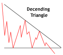
The descending triangle is recognized primarily in downtrends and is often thought of as a bearish signal. As you can see in figure 2, the descending triangle pattern is the upside-down image of the ascending triangle pattern. The two lows on the above chart form the lower flat line of the triangle and, again, have to be only close in price action rather than exactly the same. The development of the descending triangle takes the same amount of time as the ascending triangle, and volume again plays an important role in the breakout to the downside. (Some analysts believe that increased volume is not all that important. We, however, believe it to be paramount. We always consider the strength or weakness of volume as being the "straw that stirs the drink.")
Symmetrical Patterns So far we have seen two triangle patterns. One, from an uptrend and bullish market move and one from a downtrend with a decidedly bearish look. Symmetrical triangles, on the other hand, are thought of as continuation patterns developed in markets that are, for the most part, aimless in direction. The market seems listless in its direction. The supply and demand therefore seem to be one and the same.

During this period of indecision, the highs and the lows seem to come together in the point of the triangle with virtually no significant volume. Investors just don't know what position to take. However, when the investors do figure out which way to take the issue, it heads north or south with big volume in comparison to that of the indecisive days and or weeks leading up to the breakout. Nine times out of ten, the breakout will occur in the direction of the existing trend. But, if you are looking for an entry point following a symmetrical triangle, jump into the fray at the breakout point.


ConclusionThese patterns, both the symmetrical triangles on the bullish as well as the bearish side are known to experience early breakouts that give investors a "head fake." Hold off for a day or two after the breakout and determine whether or not the breakout is for real. Experts tend to look for a one-day closing price above the trendline in a bullish pattern and below the trendline in bearish chart pattern.

Remember, look for volume at the breakout and confirm your entry signal with a closing price outside the trendline.


Monday, May 21, 2012

Abandoned Baby Candlestick

Abandoned Baby Definition

The abandoned baby candlestick formation is a three bar reversal pattern that is similar to the morning and evening star formations and is a very reliable reversal signal when it occurs after a sharp rise or drop.  While it is very similar to the morning star and evening star, it has one key difference.  The real bodies and shadows cannot overlap from bar 1 to 2 and 2 to 3.  This makes this pattern very unique, rare, and reliable at the same time.  While the formation has baby in its name, just as the concealing baby swallow formation, it has more in common with the island reversal pattern.
The abandoned baby is a rapid shift in momentum from the bulls to the bears or visa versa and typically catches the other side off guard.  Rallies off an abandoned baby bottom can be very rapid as short sellers will be forced to cover fast.  Conversely, declines after the abandoned baby top can be just as fast as many longs sell their positions, aiming to keep most of their profits.

Structure of Abandoned Baby

  1. The first candlestick is in the direction of the primary trend
  2. The second candle is a doji which gaps in the direction of the primary trend, exhibiting no overlap with the real body or shadow of the previous candle
  3. The third candle is in the opposite direction of the first day and gaps in the opposite direction of the doji.

Chart Example of Abandoned Baby

Abandoned Baby
Abandoned Baby

In the above candlestick charting example, notice how the abandoned baby top comes in after a strong uptrend.  This leaves the bulls trapped at the top of the formation with very little time to exit their winning positions.  To the right of this formation is the abandoned baby bottom.  This is the exact opposite of the abandoned baby top and is often the sight of a sharp short squeeze

Support and Resistance Levels Trading Strategies

We had heard about Support and Resistance many times while we talk about day trading in stock market. If you are also in search of definition of support and resistance,support and resistance strategies, support and resistance indicators, and how to identify support and resistance levels/ranges. then I will discuss about this topic today. As a trader I think we all assume the standard rectangle with highs and lows makes up a trading range; however, there is so much more to the matter.  There are a few additional resources I would like to point out before you proceed with the article; (1) Trading Simulator (you will need to practice trading support and resistance levels with real world data) and (2) additional support and resistance articles to get a broader understanding of market influences (Fibonnaci Extensions, Trend Lines, Gap Pullback Strategy).

Defining Support and Resistance

Defining the concept of support and resistance is fairly simple. When discussing it in the context of the stock market, it defines the levels at which buyers and sellers step into a market or where the law of supply and demand come into play. Imbalances in supply and demand create support and resistance levels. For example, when an overwhelmingly high number of buyers (demand) step into the market, an indication of support is being put into the market. Conversely, a large number of sellers (supply) indicates that there is overhead resistance preventing the stock from moving higher.
The price levels which create support and resistance in a stock only tell half of the story. We mentioned a key phrase above; “overwhelmingly high”. Volume, is the second half of the equation and shows us the strength behind the buying or selling at support and resistance levels. The stronger the buying or selling is at support and resistance levels, the more important of a signal is being given.

Support and resistance can come in many forms:


Blow off tops or panic selloffs can put tops and bottoms into markets and mark important support or resistance levels for a stock.
An increasingly popular technique for determining support and resistance can be derived through the use of Fibonacci levels. These levels are viewed by some as imaginary levels but have now developed a strong significance due to their widespread use. It is almost a self-fulfilling prophecy which causes prices to stop and reverse at these levels.
Speaking of imaginary levels; many traders, especially day traders, use whole numbers to define support and resistance levels. Decade (Rs10, Rs20, etc) and century numbers (Rs100, Rs200, etc) are looked at very closely by many traders.
Many traders also use trend lines and other technical indicators such as the RSI, slow stochastic, moving averages, and CCI to derive logical levels of support and resistance in a stock.
Gaps often act as magnets for prices; for example, if a stock opens down 3 points in the morning, that price gap will most likely be filled at some later point. The close of the bar prior to the gap is considered to be support on gap ups and resistance on gap downs.

Support and Resistance Indicators

Indicators are a great addition when looking at support and resistance levels.  This is because the indicators will act as another form of validation that the security is approaching a support or resistance level.  Since support and resistance levels act in a cyclical fashion, meaning the price will bounce off of the high and lows of the range; oscillators are the best fit.  Oscillators like support and resistance levels will bounce from one extreme to the next.  Here is a list of indicators that are great with support and resistance levels: RSI and Slow Stochastics.

Not an Exact Science

Defining support and resistance levels is not an exact science. You will rarely get support levels retested at exact prices. Keep an open mind; most of the time, you will see zones of support and resistance.

Trading Ranges

A few key points we want to mention regarding trading ranges. If a stock moves out of its support and resistance boundaries with heavy volume, you are possibly looking at a shift in the character of the stock. For example, if a stock moves up through the top of its range with heavy volume, it is indicating that the buyers were able to take hold of the stock and overpower the sellers at that level. This is bullish and the former resistance level should now be considered as support on a pullback. You can almost look at it as if the bulls claimed victory at that price level.
A breakout of a trading range in which the preceding trend was sharply down is more reliable than a breakout of a trading range that comes after a rally. These are considered secondary rallies and are more prone to failure.

Conclusion

In conclusion, you must study how a stock behaves at key support and resistance levels and take note of climactic increases in volume as it typically is associated with panic or extreme levels of greed. This is a good time to look for take the opposite side of the primary trend. Remember, climactic volume eats up a large amount of buyers and sellers and tends to produce sharp snap backs in either direction as buyers have put in major support and sellers will have put in major resistance going forward.